
“`html
Understanding the Language of the Market: A Comprehensive Guide to Technical Analysis
Welcome, aspiring traders, to a deep dive into the fascinating world of technical analysis. Have you ever looked at a price chart and felt like you were staring at a foreign language? Lines, bars, squiggles… it can seem overwhelming at first. But what if we told you these charts hold vital clues about market sentiment, potential future price movements, and the collective psychology of millions of participants?
Technical analysis is precisely about learning to read this market language. It’s a powerful tool used by traders across all asset classes – stocks, bonds, commodities, and yes, especially in the dynamic foreign exchange (forex) markets. Our goal here is to demystify technical analysis for you, whether you’re just starting out or looking to deepen your understanding and refine your trading strategies.
Unlike fundamental analysis, which focuses on intrinsic value based on economic, financial, and other qualitative and quantitative factors (like company earnings, interest rates, or geopolitical events), technical analysis operates on the premise that all known information is already reflected in the price of an asset. Therefore, the chart itself – the historical record of price and volume – is the primary source of data.
The core objective? To identify patterns and trends that have historically led to predictable outcomes, thereby forecasting probable future price directions. Think of it like meteorology for the market; we’re not predicting the future with 100% certainty, but we’re using historical data and current conditions to make educated probabilistic forecasts.
- Technical analysis helps traders visualize market sentiment.
- It identifies patterns that may predict future price movements.
- Understanding this analysis enhances trading one’s techniques.
We believe that by mastering the principles of technical analysis, you can gain a significant edge in identifying potential trading opportunities, managing risk, and making more informed decisions. It requires discipline, practice, and a structured approach, but the skills you’ll develop can be invaluable on your trading journey. So, let’s begin unlocking the secrets hidden within the charts together.
The Foundational Pillars: Price, Volume, and Time
At the heart of technical analysis are three fundamental data points: Price, Volume, and Time. These are the raw ingredients from which all charts, patterns, and indicators are derived. Understanding their significance is crucial before we delve into more complex tools.
Price is arguably the most important element. It represents the consensus value of an asset at any given moment, the result of the perpetual tug-of-war between buyers and sellers. Technical analysis primarily studies price movements over time. We look at different types of prices within a specific period:
- Open: The first price traded during the period.
- High: The highest price traded during the period.
- Low: The lowest price traded during the period.
- Close: The last price traded during the period. This is often considered the most significant price, as it reflects the market’s final sentiment for that period and is used as the starting point for the next period.
The relationship between the open, high, low, and close prices provides significant visual clues, especially when presented on a candlestick chart, which we’ll explore shortly.
Volume tells us how many units of an asset were traded during a specific period. In simpler terms, it measures the activity or interest in that asset. High volume accompanying a price move suggests strong conviction behind that move, whether it’s buying or selling. Low volume, conversely, might indicate lack of interest or indecision.
For instance, if a stock price surges on very high volume, it suggests significant buying pressure is fueling the rise. If it surges on low volume, the move might be less sustainable. Volume can act as a confirmation tool for price trends and patterns. It’s the ‘fuel’ for the price ‘vehicle’. However, keep in mind that volume data might be less readily available or standardized in certain markets compared to others, like spot forex which is decentralized.
Time provides the context for price and volume data. Technical analysis is performed on different timeframes, ranging from tick charts (showing every single trade) to minute charts, hourly charts, daily charts, weekly charts, monthly charts, and even yearly charts. The timeframe you choose depends heavily on your trading style and objectives.
Are you a day trader looking to capitalize on short-term fluctuations? You’ll likely focus on smaller timeframes (minutes, hours). Are you a swing trader holding positions for days or weeks? Hourly and daily charts will be your primary focus. Are you a position trader with a long-term view? Daily, weekly, and monthly charts will be essential. It’s also common practice to look at multiple timeframes (multi-timeframe analysis) to gain a broader perspective before focusing on your chosen execution timeframe.
Mastering technical analysis starts with deeply respecting and understanding these three fundamental data points and how they interact on a chart.
| Data Point | Description |
|---|---|
| Price | Consensus value representing the market |
| Volume | Number of units traded during a specific period |
| Time | Context for analyzing price and volume dynamics |
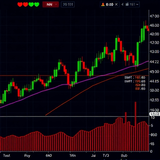
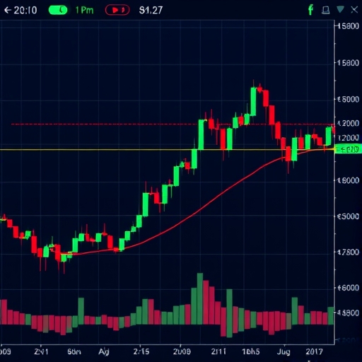
Decoding Price Action: The Art of Reading Candlestick Charts
While various chart types exist (line charts, bar charts, etc.), candlestick charts are by far the most popular among technical analysts due to the rich information they convey within a single visual element – the candlestick.

Originating in 18th-century Japan for tracking rice prices, candlesticks offer a more detailed look at price action within a given period than a simple line or bar. Each candlestick represents the price movement over a specific timeframe (e.g., 1 hour, 1 day). It tells us the open, high, low, and close prices for that period.
Let’s dissect a single candlestick:
- It has a body, which is the rectangular part. The body represents the range between the open and close prices.
- It has wicks (or shadows, or tails), which are the thin lines extending above and below the body. The top of the upper wick indicates the high price, and the bottom of the lower wick indicates the low price for the period.
The color of the body is crucial:
- A bullish candlestick (often green or white) means the closing price was higher than the opening price. The bottom of the body is the open, and the top is the close.
- A bearish candlestick (often red or black) means the closing price was lower than the opening price. The top of the body is the open, and the bottom is the close.
By observing individual candlesticks and, more importantly, sequences of candlesticks, traders can identify potential patterns that suggest shifts in market sentiment, momentum, and possible reversals or continuations of trends. These patterns are visual representations of the battle between buyers (bulls) and sellers (bears) over a period.
Simple, but powerful, candlestick patterns include:
- Doji: The open and close prices are very close or the same, resulting in a tiny body. This indicates indecision in the market. The length of the wicks can provide further clues about the volatility during the period.
- Hammer/Hanging Man: A small body (at the top for Hammer, at the bottom for Hanging Man) with a long lower wick (at least twice the length of the body) and little to no upper wick. A Hammer occurring after a downtrend can signal a potential bullish reversal. A Hanging Man after an uptrend can suggest a bearish reversal.
- Engulfing Patterns: A two-candlestick pattern where the body of the second candlestick completely “engulfs” or covers the body of the first. A Bullish Engulfing pattern (a small bearish body followed by a large bullish body) after a downtrend is a strong bullish reversal signal. A Bearish Engulfing pattern (a small bullish body followed by a large bearish body) after an uptrend is a strong bearish reversal signal.
Understanding candlesticks is fundamental. They are the basic building blocks of price action analysis and provide immediate visual cues about market dynamics within any given timeframe.
| Candlestick Pattern | Description |
|---|---|
| Doji | Indecision in the market |
| Hammer | Potential bullish reversal after a downtrend |
| Engulfing Pattern | Strong reversal signal after a trend |
Establishing Boundaries: Understanding Support and Resistance
Imagine price action as a ball bouncing up and down. Support levels are like a floor that the price struggles to break below. Resistance levels are like a ceiling that the price struggles to break above. These are key concepts in technical analysis, representing price levels where buying or selling pressure is historically strong enough to pause or reverse a trend.
How do these levels form? They emerge naturally from the market’s memory and the collective psychology of traders. When a price falls to a certain level and then bounces back up repeatedly, that level becomes a support zone. Buyers stepped in here before, and traders remember this, anticipating they might do so again. Conversely, when a price rises to a certain level and is pushed back down repeatedly, that level becomes a resistance zone. Sellers previously dominated at this price, and traders expect them to reappear.
Support and resistance levels can be horizontal lines drawn at previous swing highs and lows, or they can be dynamic, like moving averages or trend lines (which we’ll discuss later). The more times a price level is tested and holds as support or resistance, the stronger that level is considered.
What happens when a support or resistance level is broken? A decisive break often indicates a significant shift in supply and demand dynamics. When resistance is broken, it suggests buyers have overpowered sellers at that level, and the broken resistance level often turns into new support. Conversely, when support is broken, it suggests sellers have overpowered buyers, and the broken support level often becomes new resistance. This is known as the principle of polarity.
Think of it like a doorway. Once you break through a door (resistance), that doorway can now become a barrier protecting you from something on the other side (acting as support). This concept of broken levels flipping roles is incredibly important in identifying potential trend continuations or reversals.
Identifying and correctly interpreting support and resistance levels is a cornerstone of technical analysis. They help traders find potential entry and exit points, set stop-loss orders (below support in an uptrend, above resistance in a downtrend), and set target prices (at resistance in an uptrend, at support in a downtrend).
| Concept | Description |
|---|---|
| Support | Price level acting as a floor |
| Resistance | Price level acting as a ceiling |
| Principle of Polarity | Support turns to resistance and vice versa |
Mapping the Direction: Identifying and Trading Trends
One of the most fundamental tenets of technical analysis is: “The trend is your friend.” Markets tend to move in trends – sustained directional movements over time. Identifying the prevailing trend is often the first step in technical analysis, as trading with the trend tends to offer higher probability opportunities.
There are three primary types of trends:
- Uptrend (Bullish Trend): Characterized by a series of higher highs and higher lows. This signifies that buyers are consistently entering the market at increasingly higher prices, pushing the price upwards.
- Downtrend (Bearish Trend): Characterized by a series of lower highs and lower lows. This signifies that sellers are consistently pushing the price down, overwhelming buying attempts.
- Sideways Trend (Consolidation/Trading Range): When the price moves within a relatively defined horizontal range, without making consistent higher highs/lows or lower highs/lows. This indicates a period of indecision or equilibrium between buyers and sellers.
Trends can exist on different timeframes simultaneously. For example, a market might be in a long-term uptrend on a weekly chart but experiencing a short-term downtrend correction on an hourly chart. This is why multi-timeframe analysis is so valuable – it helps you understand the larger context.
How do we identify and visualize trends? The simplest way is using trend lines. A bullish trend line is drawn connecting two or more consecutive higher lows. A bearish trend line is drawn connecting two or more consecutive lower highs. Valid trend lines act as dynamic support (in an uptrend) or dynamic resistance (in a downtrend). Price bouncing off the trend line confirms its validity and the strength of the trend.
Sometimes, a trend might occur within a channel, formed by drawing a line parallel to the trend line connecting corresponding highs (in an uptrend) or lows (in a downtrend). Trading within these channels involves buying near the lower trend line (support) and selling near the upper trend line (resistance) in an uptrend, or selling near the upper trend line (resistance) and buying near the lower trend line (support) in a downtrend.
A key signal in technical analysis is the break of a trend line or channel. This can indicate a potential trend reversal or a shift into a sideways consolidation phase. However, not all breaks are valid signals; false breakouts can occur. Traders often look for confirming signals, such as increased volume or candlestick patterns, to validate a trend line break.
Understanding and trading with the trend is fundamental. It helps align your trades with the market’s primary direction, potentially increasing your probability of success. However, trends don’t last forever, and identifying potential reversals is just as crucial.
Expanding Your Arsenal: An Introduction to Technical Indicators
While analyzing raw price action, support/resistance, and trends is powerful, technical analysts often use additional tools called technical indicators to gain further insights. Indicators are mathematical calculations based on historical price and/or volume data, plotted on a chart to help identify trading opportunities, confirm trends, or signal potential reversals.
Think of indicators as filters or lenses that help highlight specific aspects of market behavior that might not be immediately obvious from just looking at the price bars themselves. They can quantify momentum, volatility, volume, and price averages, providing objective data points to aid decision-making.
It’s crucial to understand that indicators are derived from past price data; they do not predict the future with certainty. They are tools to analyze past and present market conditions to infer probable future moves based on historical tendencies. Over-reliance on indicators without understanding the underlying price action is a common mistake for beginners.
Technical indicators can be broadly categorized into several types:
- Trend-following indicators: These lag price action but help confirm the direction and strength of a trend. Examples include Moving Averages (MA) and Moving Average Convergence Divergence (MACD).
- Momentum indicators: These help identify the speed and strength of price movement and can signal overbought or oversold conditions, potentially forewarning reversals. Examples include the Relative Strength Index (RSI) and Stochastic Oscillator.
- Volatility indicators: These measure the rate of price change, indicating how much price is fluctuating over a period. Examples include Bollinger Bands and Average True Range (ATR).
- Volume indicators: These measure the trading activity associated with price movements. Examples include On-Balance Volume (OBV).
When using indicators, remember:
- No single indicator is perfect. Markets are complex. What works well in a trending market might perform poorly in a sideways market, and vice versa.
- Indicators can give false signals. They are probabilistic tools. Always look for confluence – multiple indicators or analysis techniques suggesting the same outcome.
- Customize your indicators. Most indicators have adjustable parameters (like the number of periods used in calculation). Experiment to find settings that work best for the asset you’re trading and the timeframe you’re using, but avoid excessive “curve fitting” (optimizing historical data so much that it doesn’t work on future data).
In the following sections, we’ll delve into some of the most popular and widely used technical indicators, explaining what they measure and how traders typically use them in practice.
If you’re starting to explore different trading tools and platforms to practice using these indicators, finding one that offers a wide range of instruments and robust charting capabilities is essential. Perhaps you’re interested in trading currencies or other CFDs? If you’re considering starting forex trading or exploring more CFD products, then Moneta Markets is a platform worth considering. It’s based in Australia and offers over 1000 financial instruments, suitable for both beginners and professional traders.
Measuring the Market’s Speed: Moving Averages and Momentum
Let’s explore two key types of indicators: those that follow the trend (like Moving Averages) and those that measure momentum (like RSI and MACD).
Moving Averages (MAs) are among the simplest and most popular technical indicators. A moving average smooths out price data by creating a constantly updated average price over a specified period. By averaging the price, MAs filter out random short-term fluctuations (“noise”) and help you see the underlying trend more clearly.
The two most common types are:
- Simple Moving Average (SMA): A simple average of prices over the defined period. Each point in the SMA is the average of the closing prices of the past ‘N’ periods.
- Exponential Moving Average (EMA): Gives more weight to recent prices, making it react faster to new information than an SMA.
How are MAs used?
- Identifying Trends: When the price is above a long-term MA, it suggests an uptrend. When it’s below, it suggests a downtrend. The slope of the MA also indicates the trend’s direction and strength.
- Dynamic Support/Resistance: MAs often act as dynamic support (in an uptrend) or resistance (in a downtrend), where price tends to bounce off the average.
- Crossovers: A common strategy is using two MAs of different lengths (e.g., a 50-period MA and a 200-period MA). A bullish signal occurs when the shorter-term MA crosses above the longer-term MA (a “golden cross”). A bearish signal occurs when the shorter-term MA crosses below the longer-term MA (a “death cross”).
Momentum Indicators, on the other hand, measure the speed and magnitude of price changes. They can help identify how strongly a price is moving in a certain direction and whether the move might be running out of steam. This can often give earlier signals of potential reversals than trend-following indicators.
Two prominent momentum indicators are:
- Relative Strength Index (RSI): Developed by J. Welles Wilder Jr., the RSI is a momentum oscillator that measures the speed and change of price movements. It oscillates between 0 and 100. Typically, readings above 70 are considered overbought (potentially due for a pullback or reversal), and readings below 30 are considered oversold (potentially due for a bounce or reversal).
- Moving Average Convergence Divergence (MACD): Developed by Gerald Appel, the MACD is a trend-following momentum indicator that shows the relationship between two moving averages of a security’s price. It’s calculated by subtracting the 26-period EMA from the 12-period EMA (the MACD line). A 9-period EMA of the MACD line (the signal line) is then plotted on top of the MACD line, and a histogram is also plotted. Signals are generated when the MACD line crosses above the signal line (bullish) or below it (bearish). MACD is also great for identifying divergence.
Divergence is a powerful concept in technical analysis, especially with momentum oscillators like RSI and MACD. It occurs when the price is making new highs or lows, but the indicator is not. For example, if price makes a new higher high, but the RSI makes a lower high, this is bearish divergence, suggesting the upward momentum is weakening and a potential reversal is coming. Conversely, if price makes a new lower low, but the RSI makes a higher low, this is bullish divergence, suggesting downward momentum is waning.
Using MAs to identify the trend and momentum indicators like RSI or MACD to gauge its strength and look for divergence is a common and effective combination in technical analysis.
The Backbone of Activity: Understanding Volume Analysis
Earlier, we touched upon volume as a fundamental data point. Now let’s look at how analyzing volume can provide critical insights and help validate or question price movements.
Volume is essentially the number of shares, contracts, or lots traded during a specific period. High volume indicates strong participation and interest, while low volume suggests weak participation. When you see a significant price move accompanied by high volume, it signals that many traders were actively involved in pushing the price in that direction, lending credibility to the move.
Conversely, if price makes a significant move but on low volume, it suggests that the move might not have broad market support and could be susceptible to a quick reversal. Think of it like pushing a car: if lots of people are pushing (high volume), it will move with force. If only one person is pushing (low volume), it might budge, but it’s easily stopped or pushed back.
Volume analysis is often used for:
- Confirmation of Trends: In a healthy uptrend, price rallies should ideally be accompanied by increasing volume, while pullbacks should see decreasing volume. In a healthy downtrend, price declines should see increasing volume, and bounces should see decreasing volume.
- Confirmation of Breakouts: When price breaks above resistance or below support, a strong surge in volume on the breakout candle adds significant credibility to the move, reducing the likelihood of a false breakout.
- Identifying Exhaustion Moves: Sometimes, a final surge in volume at the end of a long trend can signal capitulation (in a downtrend, heavy selling) or blow-off top (in an uptrend, frenzied buying), potentially marking the end of the trend.
- Volume Divergence: Similar to price divergence with momentum indicators, volume can diverge from price. For example, if price is making new highs but volume is decreasing, it suggests weakening buying pressure and questions the sustainability of the rally.
Some indicators specifically analyze volume, such as On-Balance Volume (OBV), which is a cumulative total volume that adds volume on up days and subtracts volume on down days, helping to gauge the overall buying/selling pressure. Another is Volume Rate of Change (VROC), which measures the percentage change in volume over a specific period.
Incorporating volume analysis into your technical study adds another layer of confirmation to your signals. Price tells you ‘what’ is happening, but volume tells you ‘how much conviction’ is behind it.
Building Your Blueprint: Combining Technical Tools for Strategy
Technical analysis is most effective when you don’t rely on a single indicator or pattern in isolation. Instead, you should learn to combine different tools and concepts to build a comprehensive trading strategy and look for confluence – multiple independent signals aligning and pointing to the same conclusion.
For example, instead of taking a buy signal just because the RSI is oversold, you might look for a situation where:
- Price is bouncing off a significant historical support level.
- A bullish candlestick reversal pattern (like a Hammer or Bullish Engulfing) forms at that support.
- A momentum indicator like the MACD shows a bullish crossover or bullish divergence at that level.
- Volume increases significantly on the bullish reversal candle.
When multiple technical signals align in this way, it provides stronger conviction for a potential trading opportunity than any single signal alone. Developing a strategy involves deciding which tools you will use, how you will interpret their signals, and under what specific conditions you will enter and exit trades.
Your strategy should also include:
- Defining Your Timeframe: What charts (e.g., 15-minute, 4-hour, daily) will you use for analysis and execution?
- Entry Criteria: What specific combination of price action, patterns, and indicator signals must be present for you to enter a trade?
- Exit Criteria:
- Stop-Loss: Where will you exit the trade if the market moves against you? This is crucial for risk management.
- Take-Profit: Where will you exit the trade if it moves in your favor? This could be at a resistance level, based on a risk/reward ratio, or when indicators give an exit signal.
- Position Sizing: How much capital will you risk on each trade? This ties directly into risk management.
| Strategy Element | Details |
|---|---|
| Timeframe | Identify relevant chart timeframes for analysis |
| Entry Criteria | Define the conditions for entering trades |
| Exit Criteria | Set parameters for stop-loss and take-profit |
Building a strategy is an iterative process. It requires learning the tools, understanding how they interact, and then testing your ideas. This testing phase, often done through historical data analysis (backtesting) and simulation (demo trading), is critical before risking real capital.
Remember, a good strategy isn’t just about finding entry signals; it’s equally, if not more, about managing your risk and knowing when to exit, whether for a profit or to cut a loss. Technical analysis provides the framework for identifying potential opportunities, but risk management provides the discipline to survive and thrive in the long run.
Protecting Your Capital: The Absolute Necessity of Risk Management
Let’s be clear: technical analysis helps you identify potential opportunities and improve your odds, but it does not eliminate risk. Markets are inherently uncertain. Prices can and do move against your position. Therefore, risk management is not an optional add-on; it is an absolutely essential pillar of successful trading, perhaps even more important than your entry strategy.
Think of risk management as the protective shield for your trading capital. Without it, even a winning strategy can lead to ruin if a few losing trades are too large. The core principles are simple but require discipline to follow consistently:
- Always Use Stop-Loss Orders: A stop-loss is an order placed with your broker to automatically close your position if the price moves against you to a predetermined level. This caps your maximum potential loss on any single trade. Placing stops based on technical levels (like below a support, above a resistance, or beyond a key pattern) is a common practice. Define your stop-loss *before* you enter the trade.
- Define Your Risk Per Trade: Decide what percentage of your total trading capital you are willing to risk on any single trade. A widely recommended guideline, especially for beginners, is to risk no more than 1% to 2% of your capital per trade. This means if your stop-loss is hit, you only lose a small fraction of your total account value. This allows you to survive drawdowns and remain in the game.
- Calculate Your Position Size: Based on your chosen risk percentage and the distance from your entry price to your stop-loss price, you can calculate exactly how many units (shares, contracts, lots) you can trade.
Position Size = (Account Capital * Risk Percentage) / (Entry Price – Stop-Loss Price) (Adjusted for currency pairs and contract sizes in forex/CFDs)
This calculation ensures that regardless of the stop-loss distance, you only risk your defined percentage of capital. A wider stop means a smaller position size, and a tighter stop means a larger position size.
- Know Your Risk-to-Reward Ratio: Before entering a trade, compare the potential profit (distance to your target price) to the potential loss (distance to your stop-loss). Aim for trades where the potential reward is significantly greater than the potential risk (e.g., 1:2, 1:3, or higher). This means even if you only win 50% of your trades, you can still be profitable because your winning trades make more than your losing trades lose.
- Avoid Emotional Trading: Fear and greed are powerful emotions that can sabotage even the best technical strategy. Stick to your pre-defined trading plan. Don’t widen your stop-loss out of fear of taking a loss. Don’t increase your position size impulsively out of greed or overconfidence.
Technical analysis helps identify *where* to potentially trade, but risk management tells you *how much* to trade and *how to protect yourself* if you’re wrong. It’s the difference between a sustainable trading career and a short-lived gamble.
Navigating the Obstacles: Common Pitfalls in Technical Analysis
As you embark on your journey with technical analysis, you’ll encounter challenges and potential traps. Being aware of common pitfalls can help you avoid costly mistakes and accelerate your learning process. Let’s look at some of these hazards:
- Over-Reliance on Indicators: While indicators are useful tools, relying solely on them without understanding the underlying price action is dangerous. Indicators are derivatives of price; price is the primary signal. Ensure you understand *why* an indicator is giving a signal in the context of the price chart.
- Curve Fitting (Over-Optimization): This involves tweaking indicator parameters or strategy rules so much that they perfectly match historical data, but fail miserably on future data. Markets are dynamic; past performance is not indicative of future results. While some optimization is okay, avoid making your strategy overly complex or specific to past price movements. Keep it robust and logical.
- Ignoring the Larger Context (Multi-Timeframe Analysis): Focusing only on your execution timeframe without looking at longer-term charts can lead you into trading against the dominant trend. A strong signal on a 5-minute chart might be just noise against a powerful trend on the daily chart. Always zoom out!
- Trading Against the Trend (Without Justification): While trading reversals can be highly profitable, it’s also higher risk. Beginners often get burned trying to pick tops and bottoms. It’s generally safer and often more profitable to trade in the direction of the prevailing trend, especially when starting.
- Not Adapting to Market Conditions: What works well in a trending market may not work in a range-bound market, and vice versa. Be aware of the current market environment. Is it volatile or calm? Trending or consolidating? Your strategy might need adjustments based on these conditions.
- Lack of Patience and Discipline: Technical analysis requires waiting for specific setups and signals that align with your plan. Impatiently jumping into trades that don’t meet your criteria (FOMO – Fear Of Missing Out) or abandoning your plan after a couple of losses due to lack of discipline are sure ways to fail. Stick to your rules!
- Ignoring Risk Management: We’ve stressed this already, but it bears repeating. The biggest pitfall is neglecting proper position sizing and stop-losses. Even a few poorly managed trades can wipe out gains from many winning trades.
- Analyzing Too Many Markets or Timeframes: Trying to watch dozens of charts across multiple timeframes can lead to information overload and paralysis by analysis. Start with a few markets and a couple of relevant timeframes. Focus on mastering those before expanding.
Learning technical analysis is a continuous process. Be prepared to learn from your mistakes, refine your approach, and always prioritize preserving your capital.
Honing Your Skills: Practice, Simulation, and Choosing Your Platform
Reading about technical analysis is a great start, but the real learning happens through practice. Applying these concepts to live charts is essential for developing your chart-reading skills and building confidence. You wouldn’t learn to ride a bike just by reading a manual, would you?
The safest and most effective way to begin practicing is through a demo account. Most online brokers offer free demo accounts that allow you to trade with virtual money in a simulated live market environment. This is invaluable for:
- Becoming familiar with your trading platform’s charting tools and how to apply indicators.
- Practicing identifying trends, support/resistance, and candlestick patterns in real-time.
- Testing and refining your trading strategy without risking real capital.
- Getting comfortable with placing trades, setting stop-losses, and managing positions.
Treat your demo account seriously, just as you would a live account. Track your simulated trades, analyze your results, and identify what worked and what didn’t. Only when you consistently demonstrate profitability and disciplined execution on a demo account should you consider transitioning to live trading with real money, and even then, start with a small amount.
Choosing the right trading platform is also a critical step. The platform is your interface with the market and your tool for technical analysis. You’ll want a platform that is reliable, user-friendly, offers robust charting capabilities, a wide range of technical indicators and drawing tools, and fast execution speed.
Different platforms cater to different needs. Some are proprietary to the broker, while others, like MetaTrader 4 (MT4) and MetaTrader 5 (MT5), are industry standards known for their extensive charting packages and algorithmic trading capabilities. Another option is Pro Trader, often a web-based platform offering a streamlined interface.
If you are looking for a forex broker that is regulated and allows global trading, Moneta Markets holds multiple international regulatory licenses such as FSCA, ASIC, and FSA. They also provide comprehensive support like segregated client funds, free VPS, and 24/7 Chinese customer service, making them a preferred choice for many traders.
Regardless of the platform, spend time getting to know it. Understand how to customize charts, apply indicators, draw trend lines, and place different types of orders. Your platform is your workbench; master your tools.
Beyond the Horizon: Exploring More Advanced Concepts (Briefly)
Once you have a solid grasp of the fundamentals – price action, support/resistance, trends, basic indicators, and risk management – you might become curious about more advanced technical analysis concepts. While we won’t delve deeply into them here, it’s good to be aware of their existence as you continue your learning journey.
- Fibonacci Sequences: These mathematical sequences and ratios (derived from nature) are applied to charts to identify potential support and resistance levels (Fibonacci Retracements) and potential price targets (Fibonacci Extensions) based on previous price swings.
- Elliott Wave Theory: This complex theory posits that market movements follow repeating patterns of “waves” driven by investor psychology, often in sequences related to Fibonacci numbers. It attempts to forecast market turns by identifying the stage of the current wave pattern.
- Harmonic Patterns: These are geometric price patterns based on specific Fibonacci ratios, such as the Gartley, Butterfly, and Crab patterns, which aim to identify precise potential reversal zones.
- Ichimoku Cloud: A comprehensive indicator originating in Japan that provides support/resistance levels, identifies trend direction and momentum, and generates trading signals from a single glance.
- Market Geometry and Price Cycles: Some traders study geometric relationships on charts or look for recurring price cycles based on historical timing.
These advanced techniques require significant study and practice to apply effectively. They are often used by experienced traders seeking additional confluence or looking for more precise entry/exit points. For now, focus on building a strong foundation with the core principles we’ve discussed. Mastery of the basics is far more important than a superficial understanding of complex techniques.
As you gain experience and potentially explore different markets like forex or other CFD instruments, you might find that different tools resonate more with your trading style. Having access to a wide range of trading instruments and platform options can be beneficial. If you’re looking for flexibility and technological advantages when choosing a trading platform, Moneta Markets is worth mentioning. It supports popular platforms like MT4, MT5, and Pro Trader, combining high-speed execution with tight spread settings to provide a good trading experience.
In Conclusion: Embarking on Your Technical Analysis Journey
We’ve covered a significant amount of ground in this guide, from the fundamental pillars of price, volume, and time to the art of reading candlesticks, identifying support and resistance, mapping trends, understanding essential indicators, building a strategy through confluence, and the absolute necessity of risk management.
Remember, technical analysis is a skill that is honed over time through study, observation, and most importantly, practice. The charts are constantly telling a story; your job as a technical analyst is to learn to listen to it.
Start by focusing on mastering the basics. Spend time looking at charts, identifying patterns, drawing support and resistance lines, and observing how price interacts with moving averages. Don’t get discouraged by losses; they are part of the learning process. Analyze what went wrong, adjust your approach, and keep practicing with discipline.
Technical analysis provides a systematic framework for analyzing market behavior and making probabilistic trading decisions. Combined with rigorous risk management and a disciplined mindset, it can be a powerful approach to navigating the financial markets.
The journey of becoming a proficient technical analyst is ongoing. Stay curious, keep learning, and remember that patience and consistency are your greatest allies. We hope this guide has provided you with a solid foundation and the confidence to continue exploring and mastering the language of the markets. Happy charting and disciplined trading!
what is a -6 spreadFAQ
Q:What does a -6 spread mean in trading?
A:It indicates that the difference between the buy and sell price is unfavorable by six units, affecting potential profitability.
Q:How does spread affect trading decisions?
A:A wider spread can indicate lower market liquidity, leading to higher costs for traders when entering or exiting a position.
Q:What can traders do to manage spread costs?
A:Traders may choose to trade during periods of high liquidity or use trading strategies that account for wider spreads, aiming to maximize potential gains.
“`
留言