

Introduction: What Are Candlesticks?
Candlestick charts have become a staple in the world of trading and investing, offering a dynamic way to visualize price movement across financial markets. Unlike basic line graphs that track only closing prices, candlesticks pack four critical data points—open, high, low, and close—into a single, intuitive symbol for each time period. Whether you’re analyzing stocks, forex, cryptocurrencies, or commodities, these compact visual tools reveal not just where prices have been, but also the underlying tension between buyers and sellers. Their strength lies in turning raw numbers into a narrative, helping traders decode market psychology and anticipate shifts in momentum. This guide breaks down the essentials of candlestick analysis, from their historical roots to practical interpretation, equipping you with the skills to read the rhythm of the markets with greater clarity.
A Brief History: The Origin of Japanese Candlesticks
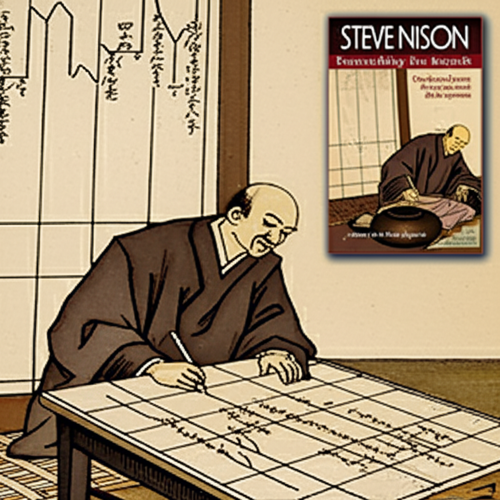
The story of candlestick charting begins not on Wall Street, but in the rice markets of 18th-century Japan. A visionary merchant named Munehisa Homma developed this method to forecast rice prices with remarkable accuracy. What set Homma apart was his recognition that price movements weren’t purely driven by supply and demand—they were also shaped by the emotions of traders. Fear, greed, and speculation played just as important a role, and Homma captured these dynamics through a visual system that evolved into what we now call Japanese candlesticks. His insights were later compiled in a text known as the *Sakata Rules*, forming the foundation of this enduring technique.
Fast forward over two centuries, and candlestick analysis remained largely unknown outside Japan until Steve Nison brought it to global attention in the late 1980s. Through his influential book, *Japanese Candlestick Charting Techniques*, Nison translated these time-tested methods for Western traders, revealing how a simple candle could convey complex market sentiment. Today, Homma’s legacy lives on in trading rooms and digital platforms worldwide. The widespread adoption of candlesticks underscores their timeless value across diverse markets and timeframes, as highlighted by trusted financial resources like Investopedia.
Anatomy of a Candlestick: Understanding the Core Components
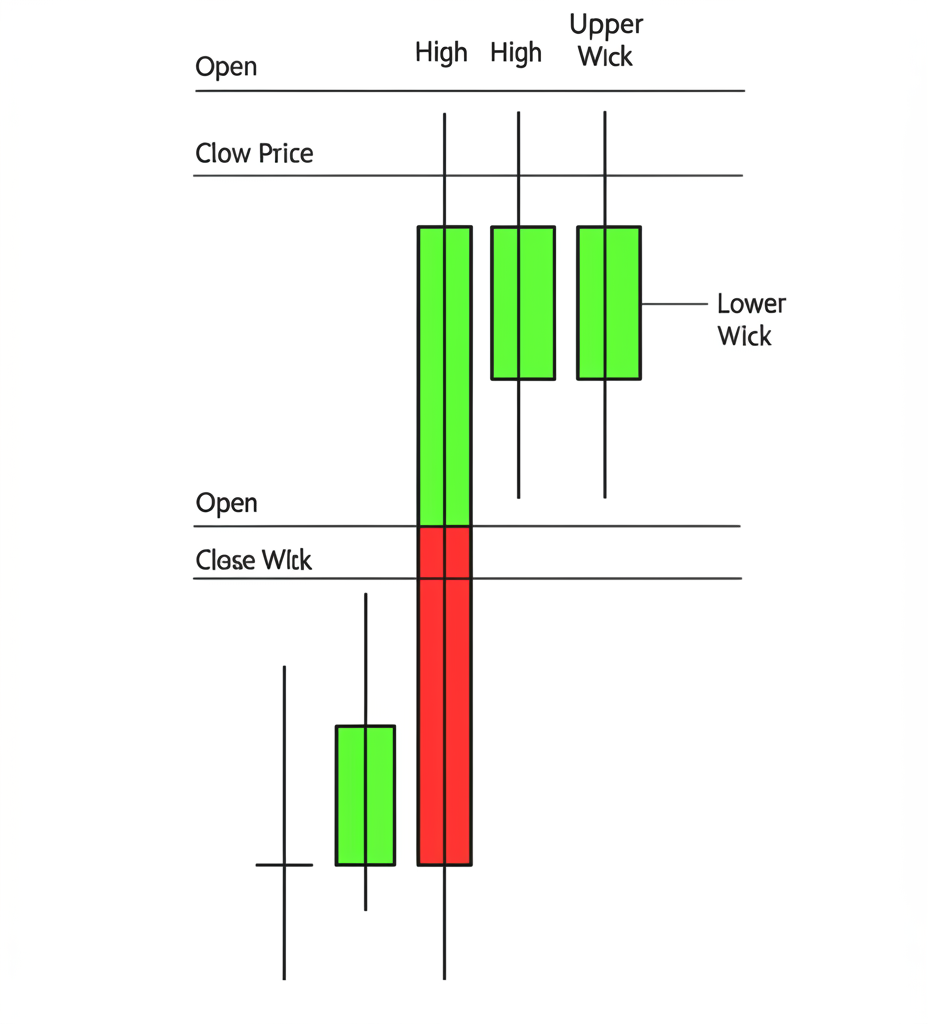
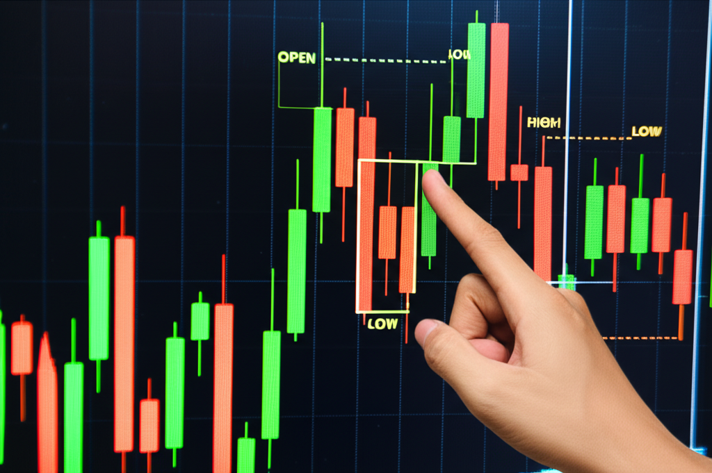
At first glance, a candlestick might seem like a simple bar, but every element carries specific meaning. Each one represents price activity over a defined period—be it one minute, one hour, or one day—and is built from four key data points: the opening price, the highest price, the lowest price, and the closing price. Together, these form the structure that allows traders to assess not just price levels, but also the intensity of market sentiment.
The Real Body: Open and Close Prices
The real body is the solid rectangular section of the candlestick, showing the range between the opening and closing prices. Its color is instantly informative:
* A **green (or white) body** means the closing price was higher than the opening price, reflecting a gain during the period and suggesting bullish momentum.
* A **red (or black) body** indicates the closing price fell below the opening price, signaling a loss and bearish control.
The length of the body adds another layer of insight. A long body—whether green or red—points to strong conviction. In a long green candle, buyers aggressively pushed prices upward. In a long red one, sellers dominated with sustained selling pressure. Conversely, a short body suggests minimal movement between open and close, often indicating hesitation, consolidation, or low participation.
The Wicks (Shadows): High and Low Prices
Extending from the top and bottom of the real body are thin lines known as wicks, or shadows. These reveal the full extent of price exploration during the period:
* The **upper wick** reaches up to the highest price traded.
* The **lower wick** extends down to the lowest price traded.
Wicks expose the hidden battles that occur within a single period. A long upper wick means prices rose significantly but were pushed back down, possibly due to resistance. A long lower wick suggests a sharp decline was reversed by strong buying interest, potentially indicating support. Short wicks imply that trading stayed close to the open and close, with little deviation—often a sign of stable or uneventful market conditions.
Decoding Candlestick Types: Bullish vs. Bearish
The most immediate takeaway from any candlestick is its color, which tells you whether the period ended in gains or losses. This visual cue is the starting point for understanding short-term market direction.
Bullish Candlesticks: Signifying Upward Momentum
A bullish candlestick, typically displayed in green or white, forms when the closing price exceeds the opening price.
* **Structure:** The open is at the bottom of the body, and the close is at the top.
* **Implication:** A long green body reflects strong buying pressure and confidence. It shows that buyers took control early and maintained it through the period, pushing prices higher. Even if there are wicks, the fact that the price closed near the high reinforces the bullish tone. This kind of candle often appears during uptrends or at key support levels, signaling potential continuation.
Bearish Candlesticks: Signaling Downward Pressure
A bearish candlestick, usually red or black, occurs when the closing price is below the opening price.
* **Structure:** The open is at the top of the body, and the close is at the bottom.
* **Implication:** A long red body demonstrates sustained selling pressure. Sellers overwhelmed buyers, driving the price down over the course of the period. The longer the body, the more decisive the move. Such candles are common in downtrends or after failed breakout attempts, often confirming bearish momentum or marking a shift in sentiment.
How to Read a Single Candlestick: Interpreting Price Action
Reading a single candlestick is like interpreting a snapshot of a market’s internal struggle. Each component—body, wicks, color—tells part of the story. When combined, they paint a richer picture of who’s in control and how forcefully.
The Significance of Body Length
* **Long Body (Bullish or Bearish):** A long real body signals strong momentum. In a bullish candle, it means buyers were aggressive and confident. In a bearish one, it shows sellers were in charge. The length correlates with the intensity of the move—longer bodies mean greater conviction.
* **Short Body (Bullish or Bearish):** A small body, regardless of color, suggests indecision. The opening and closing prices are close, indicating a tug-of-war with no clear winner. This often occurs during consolidation phases or ahead of major news events when traders are观望.
The Role of Wick Length
* **Long Upper Wick, Short Lower Wick:** Prices moved higher, but sellers stepped in and drove them back down before the close. This can signal rejection at resistance levels, especially if it appears after an uptrend.
* **Long Lower Wick, Short Upper Wick:** Sellers pushed prices down, but buyers rallied and reclaimed ground. This is often seen as a sign of support, particularly at market lows.
* **Short Wicks on Both Ends:** Most trading activity occurred between the open and close, with little testing of extremes. This suggests a stable or low-volatility environment.
* **Long Wicks on Both Sides:** Indicates high volatility and a wide price range. If the body is small (like in a Doji or Spinning Top), it reflects a balanced battle—neither buyers nor sellers gained control. This pattern can precede a reversal, especially if volume is high.
Combining Body and Wicks for Market Sentiment
The real power of candlestick analysis comes from reading the interplay between the body and the wicks:
* **Strong Bullish Signal:** A long green body with short wicks shows consistent buying pressure throughout the period, with little pushback.
* **Strong Bearish Signal:** A long red body with minimal wicks indicates sustained selling, with buyers unable to mount a counterattack.
* **Potential Reversal or Indecision:** A small body with long wicks suggests uncertainty. For example, a bullish candle with a long upper wick shows buyers pushed prices up but faced strong resistance—this might hint at exhaustion, even if the close was higher.
Why Candlesticks Matter: Their Purpose in Technical Analysis
Candlesticks are more than decorative chart elements—they are essential tools for interpreting market behavior. Their value lies in transforming abstract price data into a visual story that traders can quickly understand.
Visualizing Price Trends and Volatility
One of the greatest strengths of candlestick charts is their ability to convey trends and volatility at a glance. A sequence of green candles, especially those with long bodies, clearly illustrates an uptrend fueled by consistent buying. A string of red candles tells the opposite story. The wicks add depth—long wicks suggest frequent price swings and potential turning points, while short wicks reflect stability. This visual efficiency allows traders to assess market conditions rapidly, making it easier to spot opportunities or threats. As noted by financial educators like Fidelity, candlesticks simplify complex data into an accessible format, making them ideal for both beginners and experienced analysts.
Foundation for Candlestick Patterns and Trading Strategies
While individual candles offer insights, their true strategic value emerges when viewed in sequence. Certain combinations form recognizable patterns—such as the Hammer, Engulfing, or Doji—that traders use to anticipate reversals or continuations. These patterns rely on the foundational knowledge of single candlestick anatomy. For instance, a bullish engulfing pattern only makes sense if you understand that a large green body overtaking a prior red body signals a shift in control. Mastering individual candles is the first step toward building a robust technical strategy that incorporates multiple confirmation signals.
Common Beginner Pitfalls and Misconceptions
Despite their widespread use, candlesticks are often misinterpreted—especially by new traders. Avoiding these common errors can significantly improve decision-making.
1. **Over-relying on a Single Candle:** One candle provides a momentary snapshot, not a full strategy. Acting on a single bullish signal during a strong downtrend, for example, can lead to losses. Always consider the broader context, including prior price action and trend direction.
2. **Ignoring Timeframes and Context:** A bullish candle on a 5-minute chart may be insignificant if the daily trend is bearish. Higher timeframes often carry more weight. Align your analysis across multiple timeframes to avoid noise-driven decisions.
3. **Misreading Wick Signals:** A long upper wick doesn’t automatically mean a reversal. In an uptrend, it might simply reflect healthy profit-taking before the rally resumes. The key is to look at the bigger picture and wait for confirmation.
4. **Expecting Guaranteed Outcomes:** Candlesticks reflect past behavior and suggest probabilities, not certainties. Markets are influenced by countless factors, including news and macroeconomic data. Use candlesticks as part of a broader analytical approach, not as standalone predictors.
5. **Confusing Indecision with Reversal:** Patterns like the Doji or Spinning Top indicate balance between buyers and sellers, not necessarily an imminent trend change. They signal a pause, not a pivot. Wait for the next candle to confirm direction before acting.
To trade effectively, combine candlestick signals with volume analysis, moving averages, or other technical tools. Patience and confirmation are key—rushing into trades based on isolated signals often leads to disappointment.
Candlesticks vs. Other Chart Types: A Quick Comparison
Different traders prefer different chart styles, but candlesticks offer unique advantages in readability and insight.
| Chart Type | Information Conveyed | Key Advantage | Key Disadvantage |
|---|---|---|---|
| **Line Chart** | Only closing prices over time. | Simplest for identifying overall trends. | Lacks detailed price action (open, high, low). |
| **Bar Chart** | Open, High, Low, Close (OHLC) using vertical bars and horizontal ticks. | Provides OHLC data for each period. | Less visually intuitive for quick sentiment assessment; body color isn’t as prominent. |
| **Candlestick Chart** | Open, High, Low, Close (OHLC) using bodies and wicks, with color indicating direction. | Highly visual, quickly conveys market sentiment (bullish/bearish) and price action intensity. Easy to spot patterns. | Can appear complex to absolute beginners due to multiple components. |
Candlestick charts stand out because of their color-coded bodies, which instantly communicate whether buyers or sellers won the period. This visual clarity makes it easier to gauge sentiment at a glance. While bar charts display the same OHLC data, they lack the immediate emotional impact of a green or red body. Line charts, though useful for spotting long-term trends, omit crucial intraday details. For most traders, candlesticks strike the ideal balance between detail and readability.
Conclusion: Mastering the Language of Candlesticks
Candlesticks are more than just tools—they are a language. Each one speaks to the ongoing conflict between supply and demand, capturing the emotions that drive market moves. By learning to interpret their bodies, wicks, and colors, you gain access to a deeper understanding of price behavior. This knowledge empowers you to spot trends, assess volatility, and identify potential turning points with greater confidence. While they shouldn’t be used in isolation, candlesticks form the backbone of effective technical analysis. With practice and proper context, they become an indispensable part of any trader’s toolkit, helping you navigate the markets with clearer vision and more informed decisions.
What is the main purpose of using candlestick charts?
The main purpose of using candlestick charts is to provide a comprehensive visual summary of price action within a specific time frame. Each candlestick displays the open, high, low, and close prices, along with the prevailing market sentiment (bullish or bearish) through its color and body length. This allows traders and investors to quickly assess supply and demand dynamics, volatility, and potential trend changes.
What do the colors (green/red or white/black) of a candlestick signify?
The colors of a candlestick signify the relationship between the opening and closing prices:
- Green (or White) Candlestick: Indicates a bullish period where the closing price was higher than the opening price, suggesting buying pressure.
- Red (or Black) Candlestick: Indicates a bearish period where the closing price was lower than the opening price, suggesting selling pressure.
What is the difference between the body and the wick (shadow) of a candlestick?
The “body” (or real body) of a candlestick represents the range between the opening and closing prices. Its color shows whether the price closed higher or lower than it opened. The “wicks” (or shadows), which are the thin lines extending from the body, represent the highest and lowest prices reached during the period. The upper wick shows the high, and the lower wick shows the low.
Are candlesticks reliable for predicting future price movements?
Candlesticks are powerful analytical tools that help assess probabilities and potential market directions, but they are not infallible predictors of future price movements. They reflect past and current market sentiment and can suggest likely scenarios, but they do not guarantee outcomes. It’s crucial to use them in conjunction with other technical indicators, fundamental analysis, and risk management strategies.
Who invented candlestick charts and why are they called “Japanese candlesticks”?
Candlestick charts were invented by Munehisa Homma, an 18th-century Japanese rice merchant. They are called “Japanese candlesticks” because of their origin in Japan, where Homma developed them to analyze and predict rice prices by factoring in market psychology alongside price data.
How does a candlestick chart differ from a bar chart?
Both candlestick charts and bar charts display the open, high, low, and close prices for a period. However, candlestick charts use a distinct “real body” that is colored to immediately indicate whether the closing price was higher or lower than the opening price, offering a more intuitive visual representation of market sentiment. Bar charts use a vertical line with small horizontal ticks to denote open and close, which can be less visually striking for quick analysis.
What is meant by “open,” “close,” “high,” and “low” in a candlestick?
These are the four essential price points captured by each candlestick for a given time period:
- Open: The price at which the asset first traded when the period began.
- High: The highest price the asset traded at during the period.
- Low: The lowest price the asset traded at during the period.
- Close: The price at which the asset last traded when the period ended.
Do candlesticks only apply to stocks, or can they be used for other assets?
Candlesticks are universally applicable and can be used to analyze price action across virtually all financial markets. This includes stocks, foreign exchange (forex), cryptocurrencies, commodities, bonds, and derivatives. Their visual nature makes them a versatile tool for any asset where price data is charted over time.
Is a long wick always a sign of reversal?
Not always. While a long wick can often indicate price rejection and a potential struggle between buyers and sellers, which might precede a reversal, it is not a standalone reversal signal. The interpretation depends heavily on the context, the position of the wick relative to the body, the overall trend, and confirmation from subsequent candlesticks or other indicators. A long wick primarily signals volatility and indecision at that price level.
What is a “candlestick pattern” and how does it relate to individual candlesticks?
A “candlestick pattern” is a specific formation of two or more consecutive candlesticks that, when combined, are believed to signal potential future price movements, such as reversals or continuations of a trend. Individual candlesticks are the fundamental building blocks of these patterns. Understanding the meaning of each single candlestick is essential before you can effectively interpret and use complex candlestick patterns in your trading strategy.
留言