

Introduction to the RRG Trading Tool

Navigating today’s fast-moving financial markets demands more than just price charts and gut instinct. Traders and investors need tools that reveal not only where assets stand, but how they’re moving in relation to the broader market. Enter the Relative Rotation Graph (RRG) — a dynamic analytical instrument that transforms the way market participants assess relative strength and momentum. Unlike traditional indicators that focus on absolute performance, RRG offers a multidimensional view by comparing a basket of securities against a benchmark, making it easier to spot emerging trends, detect shifts in leadership, and prioritize high-conviction opportunities. Whether you’re managing a diversified portfolio or fine-tuning individual trades, RRG delivers a visual clarity that cuts through market noise and enhances strategic decision-making.
What is a Relative Rotation Graph (RRG)?
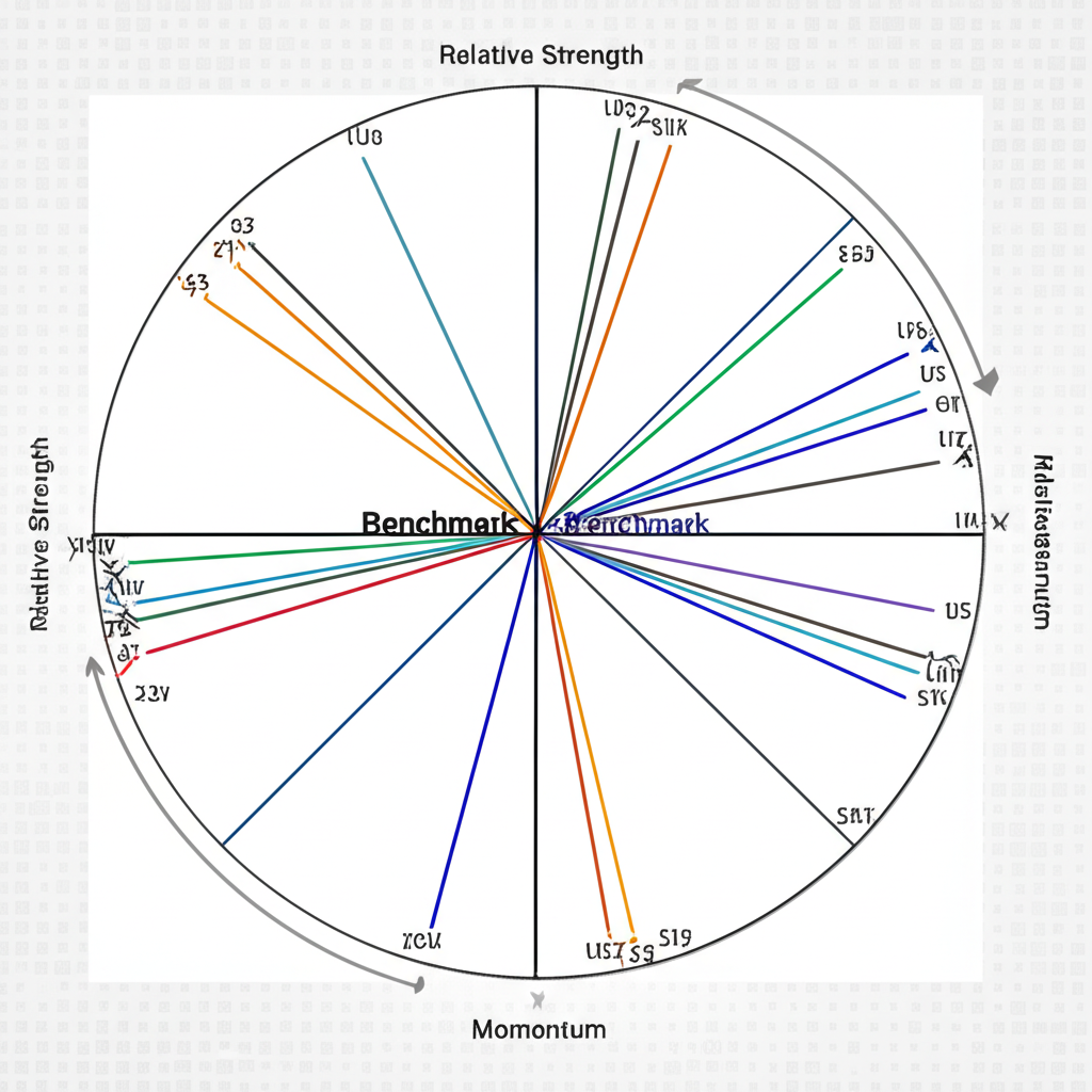
Developed by Jurrien Timmer and Trevor Neil during their tenure at Rabobank, the Relative Rotation Graph (RRG) was later refined and popularized through StockCharts.com. At its core, RRG is a proprietary visualization system that plots the relative performance of multiple assets against a user-defined benchmark, such as the S&P 500 or the US Dollar Index. What sets RRG apart is its dual-axis framework, which isolates two critical components of market behavior:
- Relative Strength (RS) Ratio: This measures how an asset performs compared to the benchmark. A rising ratio signals outperformance, while a declining one indicates lagging returns.
- RS-Momentum: This captures the rate of change in the relative strength itself. Positive momentum means the asset is gaining ground relative to the benchmark; negative momentum suggests it’s losing that edge.
These two metrics form the X and Y axes of the RRG chart, creating a real-time map of how different securities evolve in relation to each other and the market. Instead of sifting through spreadsheets or scattered indicators, traders gain an instant, intuitive snapshot of competitive positioning across sectors, stocks, or asset classes.
The Four Quadrants: Leading, Improving, Weakening, Lagging
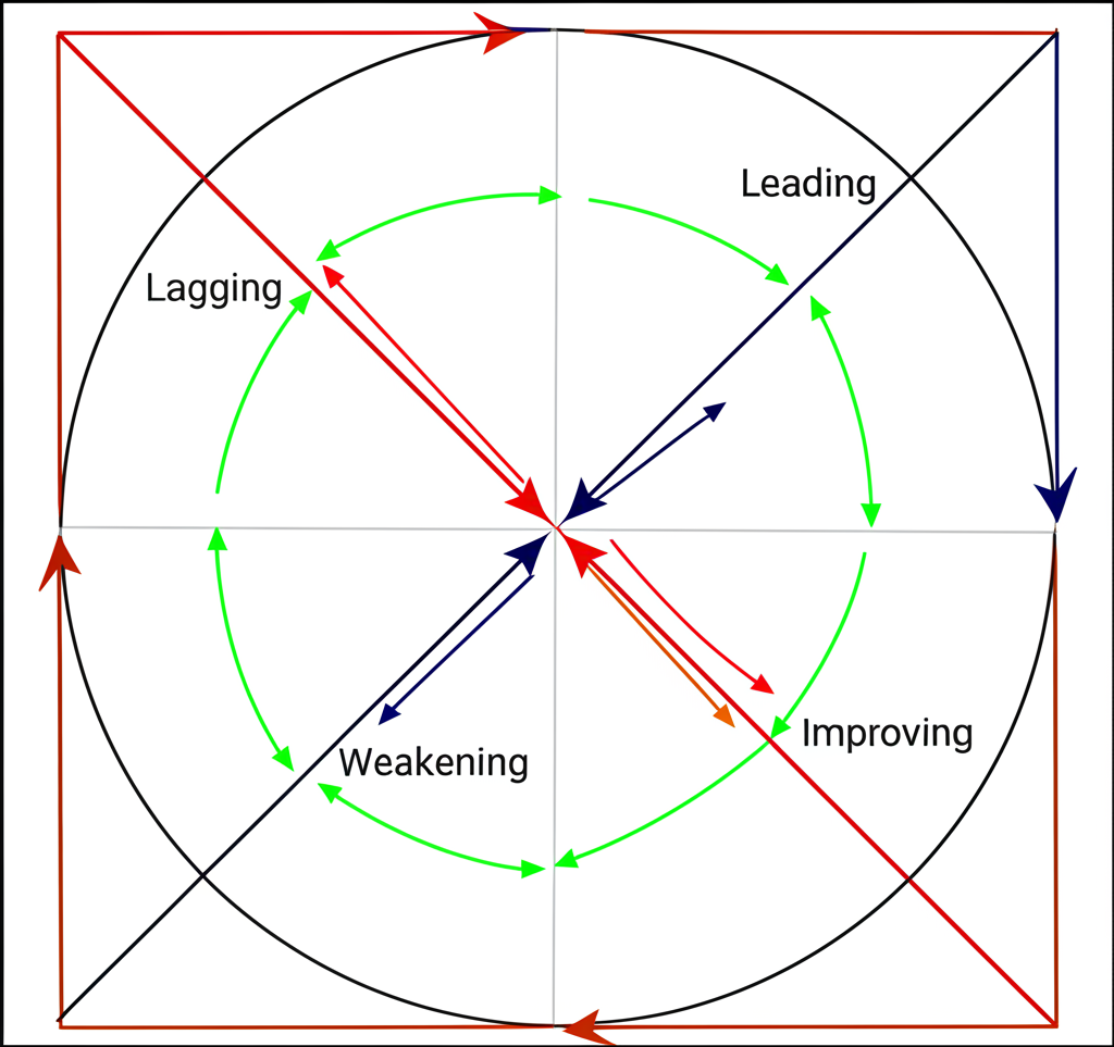
The RRG chart is segmented into four quadrants, each representing a distinct phase in an asset’s relative lifecycle. Understanding these zones is essential for interpreting movement and anticipating future shifts.
- Leading (Top Right): Assets here are outperforming the benchmark with accelerating momentum. They represent current market leaders and are often prime candidates for holding or initiating long positions.
- Improving (Bottom Right): Though still underperforming, these assets are showing signs of strength. Their momentum is turning upward, suggesting a potential breakout from weakness. This quadrant often highlights early-stage recovery plays.
- Weakening (Bottom Left): These assets have strong relative performance but are losing momentum. While they may still be ahead of the benchmark, their dominance is fading — a red flag for traders considering new entries or planning exits.
- Lagging (Top Left): Found here are the weakest performers — assets that are both underperforming and seeing deteriorating momentum. These may warrant avoidance or consideration for short strategies, especially if the trend shows no signs of reversal.
By tracking where assets reside and how they move between quadrants, investors can detect turning points before they become obvious in price alone.
Key Principles of RRG Analysis
To extract maximum value from RRG, traders must grasp several foundational principles that govern its interpretation:
- Central Role of the Benchmark: Every reading is relative. The benchmark sits at the origin point (0,0), and all asset positions are measured in relation to it. Choosing the right benchmark — whether it’s a broad index, sector ETF, or currency — directly impacts the relevance of the insights gained.
- Interpreting the Tail (or Path): Each asset leaves a visible trail over time, typically spanning 20 to 50 periods. The length and direction of this tail reveal the persistence and strength of its relative movement. A long, smooth tail into the Leading quadrant implies sustained institutional buying, while a jagged or short path near the center suggests indecision or volatility.
- Clockwise Rotation Pattern: Most assets follow a natural cycle: from Lagging to Improving, then Leading, followed by Weakening, and finally back to Lagging. This clockwise motion reflects the typical ebb and flow of market leadership. Deviations — such as counter-clockwise movement — can signal powerful countertrends or rapid regime shifts, often seen during macroeconomic shocks or sentiment reversals.
Mastering these elements allows traders to move beyond static snapshots and engage with the market as a living, rotating ecosystem.
How to Effectively Interpret RRG Charts
Reading an RRG chart goes beyond identifying which quadrant an asset occupies. True insight comes from analyzing motion, trajectory, and context. Here’s a practical guide to decoding RRG data with precision:
- Begin with the Benchmark: Remember, the center of the chart represents neutrality. The farther an asset is from the origin, the stronger its relative performance — positive or negative.
- Locate the Quadrants: Identify where each asset falls. A cluster in the Leading quadrant might indicate a sector-wide rally, while isolated positions suggest idiosyncratic strength.
- Study the Tails: Look at the path each asset has taken. A tail sweeping from Improving into Leading suggests building strength. One retreating from Leading into Weakening warns of fading momentum, even if prices remain elevated.
- Watch for Groupings: When multiple assets within a sector move in tandem — say, several tech stocks advancing together — it validates broader thematic strength. Conversely, divergence within a group may hint at selective winners and losers.
- Follow the Rotation: Track the directional flow. Entries into Leading from Improving often precede strong price gains. Exits from Weakening into Lagging may foreshadow deeper corrections.
- Assess Speed and Spacing: The density of points along the tail reflects momentum intensity. Wide spacing indicates rapid change; tight clustering suggests consolidation or hesitation.
For instance, a commodity ETF with a long, steady tail deep in the Leading quadrant during a risk-on environment could signal sustained investor appetite. In contrast, a stock with a tail looping around the center may reflect confusion or lack of directional consensus.
Identifying Entry and Exit Signals with RRG
While RRG doesn’t generate precise buy/sell timestamps, it excels at providing directional context — a crucial edge when timing trades. When combined with price action or volume confirmation, RRG signals can significantly improve decision quality.
- Buy Signal (Entry): One of the most reliable setups occurs when an asset transitions from the Improving quadrant into Leading. This shift confirms not just recovery, but accelerating outperformance. A breakout above resistance on the price chart or rising volume adds further validation.
- Hold or Caution Signal: Movement from Leading into Weakening doesn’t necessarily call for immediate exit, but it does signal caution. It may be wise to lock in profits, tighten stops, or avoid adding to existing positions.
- Sell or Short Signal: Crossing from Weakening into Lagging is a bearish confirmation. At this point, both relative strength and momentum are deteriorating — a strong indication of sustained underperformance. This can be especially powerful when accompanied by breakdowns in price or bearish candlestick patterns.
- Watchlist Signal (Rebound Potential): When an asset climbs from Lagging into Improving, it suggests the worst may be over. While not a buy signal yet, it marks a potential inflection zone worth monitoring for future entry opportunities.
Used in conjunction with other tools, RRG becomes a powerful filter for identifying high-probability trade ideas across various timeframes.
Applications of RRG Trading Tools in Diverse Markets
One of RRG’s greatest strengths lies in its adaptability. It’s not confined to equities or any single asset class. Instead, it serves as a universal framework for comparing performance across virtually any financial instrument.
Sector Rotation and Asset Allocation
RRG shines in tactical asset allocation. By plotting major sectors — such as Technology, Energy, Healthcare, and Utilities — against the S&P 500, investors can visualize which areas are gaining traction and which are losing favor. For example, during periods of economic expansion, cyclical sectors like Industrials and Consumer Discretionary often migrate into the Leading quadrant, while defensive sectors like Consumer Staples may drift into Weakening or Lagging. This insight enables portfolio managers to rotate capital proactively, aligning exposures with prevailing market winds rather than reacting after the fact.
Stock Selection and Individual Security Analysis
Once a strong sector is identified, RRG can drill down further. Traders can compare individual stocks within that sector against its ETF or index. For instance, if the Semiconductor ETF (SOXX) is in the Leading quadrant, plotting top holdings like NVDA, AMD, and INTC against SOXX reveals which companies are outperforming even within a strong group. This layered approach — top-down sector analysis followed by bottom-up stock selection — helps concentrate investments in the highest-momentum names, enhancing portfolio efficiency.
RRG for Forex and Commodity Trading
The methodology extends seamlessly to foreign exchange and commodities. In Forex, currency pairs such as EUR/USD, GBP/USD, and AUD/USD can be measured against the US Dollar Index (DXY). If EUR/USD shows a tail moving into Leading while others lag, it suggests euro strength beyond mere dollar weakness. In commodities, traders can compare gold, silver, oil, and copper against a benchmark like the Bloomberg Commodity Index. During inflationary periods, precious metals often advance into Leading, signaling safe-haven demand. Similarly, energy commodities may dominate during supply shocks. These insights support strategic positioning in futures, options, or commodity-linked ETFs.
Choosing the Best RRG Trading Tool: Free vs. Paid Platforms
Access to RRG varies significantly across platforms, ranging from fully integrated professional suites to community-driven free tools. Your choice should align with your trading style, budget, and analytical needs.
Popular RRG Platforms and Their Features
- StockCharts.com (Native RRG): As the official home of RRG, StockCharts offers the most polished and feature-rich implementation. Its seamless integration allows users to switch between sector, industry, and custom universes effortlessly. With robust data, flexible benchmarking, and extensive educational resources, it remains the gold standard. StockCharts’ RRG resources provide deep dives into methodology and application.
- Optuma: Favored by institutional analysts and advanced retail traders, Optuma delivers deep customization. Users can tweak calculation parameters, overlay proprietary indicators, and create complex multi-layered RRG analyses. It’s ideal for those who demand precision and control over their analytical workflows.
- Interactive Brokers (IBKR): Through its Trader Workstation (TWS), IBKR integrates RRG directly into its trading interface. This integration allows for real-time analysis and immediate execution, making it a practical choice for active traders who prefer an all-in-one environment.
- TradingView (Custom Scripts/Indicators): While TradingView lacks native RRG support, its open scripting ecosystem hosts numerous user-created RRG tools. These Pine Script indicators vary in accuracy and functionality, but many offer solid approximations of the original model. They’re particularly valuable for budget-conscious traders seeking visual relative strength analysis without a subscription fee.
Free RRG Tools and Alternatives
True native RRG tools are typically commercial, but several free alternatives can deliver similar insights:
- TradingView Community Scripts: A simple search for “RRG” in the indicator library yields dozens of user-submitted versions. Some are well-coded and regularly updated, offering functional visualizations of relative strength and momentum.
- Relative Strength Screeners: Platforms like Finviz allow filtering stocks by relative strength metrics. While not graphical, these screeners help identify top performers that can then be monitored manually using basic charting tools.
- DIY Solutions in Excel: For those comfortable with data manipulation, building a simplified RRG in Excel is feasible. By importing historical prices for assets and a benchmark, calculating RS ratios and momentum, and plotting them on a scatter chart, you can create a functional prototype. It’s labor-intensive but offers full transparency and customization.
However, free tools often come with trade-offs: delayed data, limited historical tails, minimal support, and potential calculation inaccuracies.
Key Considerations When Selecting an RRG Tool
When evaluating platforms, keep the following factors in mind:
- Data Quality and Coverage: Ensure the platform supports the markets and instruments you trade, with reliable and timely data feeds.
- Charting Flexibility: Look for customizable timeframes, benchmarks, color schemes, and annotation tools to enhance readability.
- User Experience: A clean, intuitive interface reduces friction and speeds up analysis, especially during fast-moving markets.
- Cost vs. Value: Weigh the features against your budget. Premium tools offer depth; free ones offer accessibility.
- Broker Integration: If you trade frequently, a platform that combines RRG analysis with order execution can streamline your workflow.
- Educational Support: Access to tutorials, webinars, and active user communities can accelerate learning and troubleshooting.
Advanced RRG Strategies and Tips for Maximizing Performance
To fully leverage RRG, traders should go beyond basic quadrant interpretation and integrate it into a broader analytical framework.
Combining RRG with Other Technical Indicators
RRG reveals relative dynamics, but pairing it with complementary tools strengthens signal reliability:
- Volume: A surge in volume as an asset enters the Leading quadrant confirms institutional participation. Low volume during a move into Lagging may suggest passive selling rather than aggressive distribution.
- MACD: A bullish MACD crossover coinciding with entry into the Leading quadrant reinforces momentum. Conversely, a bearish crossover as an asset moves into Weakening adds weight to a potential exit.
- RSI: An asset entering Leading with an RSI below 70 is less likely to be overbought, suggesting room for further upside. One entering with an RSI above 70 may face short-term resistance.
- Moving Averages: Price breaking above the 50-day or 200-day moving average while the RRG tail advances into Leading provides strong confluence. The opposite scenario — price below key averages while RRG moves into Lagging — strengthens bearish convictions.
This multi-layered approach filters out false signals and increases the probability of successful trades.
Common Pitfalls and How to Avoid Them
Even powerful tools have limitations. Being aware of common mistakes helps avoid costly errors:
- Misreading Counter-Clockwise Moves: While most rotations follow a clockwise path, counter-clockwise shifts do occur — and they’re not always warning signs. For example, a jump from Leading to Improving might reflect a healthy pullback within a strong uptrend, not a reversal. Similarly, a move from Lagging to Weakening could be a temporary bounce in a downtrend.
- Signal Lag: Because RRG relies on historical data, signals emerge after the fact. Always confirm with current price action to avoid chasing moves.
- Overdependence on RRG Alone: RRG doesn’t assess fundamentals. A stock with strong relative momentum but declining earnings or governance issues may be a value trap. Always cross-check with financial health metrics.
- Neglecting Timeframes: An asset might appear Leading on a daily chart but be deep in Lagging on a weekly view. Analyzing multiple timeframes ensures alignment between tactical entries and strategic positioning.
By treating RRG as part of a comprehensive strategy — not a standalone oracle — traders can harness its full potential while minimizing risk.
Conclusion: Empower Your Trading with the RRG Tool
The Relative Rotation Graph is more than just a chart — it’s a lens through which the financial markets become clearer and more navigable. By transforming complex relative performance data into an intuitive visual format, RRG empowers traders to see patterns invisible to conventional analysis. From identifying emerging leaders and fading laggards to guiding asset allocation and trade timing, its applications span equities, forex, commodities, and cryptocurrencies. When combined with sound risk management, technical confirmation, and fundamental awareness, RRG becomes a cornerstone of modern market analysis. Whether you’re a portfolio manager adjusting sector weights or a swing trader hunting for momentum plays, mastering the RRG tool can elevate your edge, clarity, and confidence in the markets.
Frequently Asked Questions (FAQ)
What does RRG stand for?
RRG stands for Relative Rotation Graph. It is a unique charting technique used to visualize the relative strength and momentum of a group of assets against a chosen benchmark.
How accurate is the RRG trading tool for predicting market movements?
RRG is a powerful analytical tool for identifying relative strength and momentum trends, but it is not a predictive tool in itself. It shows what is currently happening and helps anticipate potential future rotations based on historical patterns. Its accuracy is enhanced when combined with other forms of analysis, such as price action, volume, and fundamental data.
Can I use RRG for day trading or swing trading?
Yes, RRG can be adapted for both day trading and swing trading by adjusting the timeframes. For swing trading, daily or 4-hour RRG charts are typically used. For day trading, shorter timeframes like 60-minute or 30-minute charts can be applied, though the signals may be more volatile and require quicker decision-making. It is generally more effective for swing and position trading due to the inherent lag in relative strength calculations.
What are the main limitations of using Relative Rotation Graphs?
The main limitations of RRG include:
- Lagging Indicator: Like most technical tools, RRG uses historical data, so its signals have a degree of lag.
- Not a Standalone Tool: It should not be used in isolation but rather combined with other indicators and fundamental analysis.
- Benchmark Dependency: The choice of benchmark significantly influences the interpretation, and an inappropriate benchmark can lead to misleading insights.
- Complexity for Beginners: While visual, understanding the nuances of rotation and movement can be challenging for new traders.
Which platforms offer the best RRG charts for free?
Native, fully-featured RRG charts are mostly proprietary and found on paid platforms like StockCharts.com and Optuma. However, for free options, community-created RRG indicators are available on platforms like TradingView. While their quality and accuracy can vary, they offer a way to access RRG-like visualizations without cost. Building a simplified version in Excel is also possible for those with technical skills.
How do I set up an RRG chart on TradingView?
On TradingView, you generally cannot set up a native RRG chart directly as it’s not a built-in feature. Instead, you’ll need to search for “RRG” in the “Indicators” or “Invite-only scripts” section. Numerous users have published custom RRG scripts; select one, apply it to your chart, and then configure the assets and benchmark as per the script’s instructions. Always review user reviews and ensure the script is reliable.
Is the RRG trading tool suitable for beginners?
While RRG is highly visual and intuitive once understood, its underlying principles and nuanced interpretations can be challenging for absolute beginners. Intermediate to advanced traders who have a grasp of relative strength and momentum will find it most beneficial. Beginners should first familiarize themselves with basic technical analysis and then gradually incorporate RRG with proper education.
How does the RRG trading tool help in identifying market leadership and laggards?
RRG directly identifies market leadership and laggards through its quadrant system. Assets in the “Leading” quadrant are outperforming the benchmark with increasing momentum, signaling market leadership. Conversely, assets in the “Lagging” quadrant are underperforming with decreasing momentum, indicating laggards. The rotation through these quadrants provides a dynamic view of shifts in market dominance.
What is the primary benefit of using RRG charts over traditional momentum indicators?
The primary benefit of RRG charts over traditional momentum indicators is their ability to visualize relative strength and momentum in a single, intuitive graph. Traditional indicators often measure absolute momentum of a single asset. RRG, however, shows how a group of assets performs against a benchmark and each other, revealing cyclical rotations and intermarket relationships that are not apparent with standard indicators. This makes it excellent for sector rotation and asset allocation.
Can RRG be used for cryptocurrency analysis?
Yes, RRG can certainly be applied to cryptocurrency analysis. You can plot various cryptocurrencies against a benchmark like Bitcoin (BTC) or a broad crypto market index. This helps identify which altcoins are showing relative strength and momentum compared to the overall crypto market or Bitcoin dominance. The principles of quadrant rotation apply equally to the volatile crypto space, helping identify potential outperformers or underperformers.
留言